Coding A Navbar In 7 Simple Steps With Flexbox
Absolute, relative and fixed positioning, negative margins, float, clears, and inline-blocks. Just this list alone gives me a nostalgic sense of suffocation and makes HTML and CSS newbies freeze in fright. For decades designers and front-end developers have struggled, hacked, and tortured their way through using these CSS properties to simply try and make their websites display across browsers and screen sizes the way they want them to.
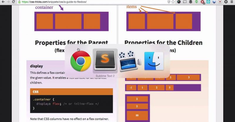
But struggle no more! Because we now have flexbox; possibly the best thing to happen to layouts, since… no not sliced bread. No better than that, possibly since CSS itself. With flexbox you can now laugh in the face of complex layouts and responsive designs as you battle the evils of differing screen sizes and browsers with your new trusty sidekick!
And in this weeks edition of HTML & CSS Tricks I’m going to walk you through exactly how to use flexbox in order to create a simple navbar with multiple list elements in 7 simple steps. And in the process we’ll cover some bonuses: Emmet, child element pseudo-classes, and Autoprefixer.
source


